" width="15px"><path d="M 1.43 0.238 C 1.103 -0.079 0.573 -0.079 0.245 0.238 C -0.082 0.556 -0.082 1.071 0.245 1.389 Z M 0.838 0.814 L 0.245 1.389 L 5.032 6.039 L 5.625 5.464 L 6.217 4.888 L 1.43 0.238 Z" fill="rgb(255, 255, 255)" height="6.03928782068968px" id="gkTm47xQl" transform="translate(6.016 0)" width="6.2172058083977415px"/><path d="M 0.802 1.558 L 0 1.558 L 0 0 L 0.802 0 Z M 14.198 0 C 14.641 0 15 0.349 15 0.779 C 15 1.21 14.641 1.558 14.198 1.558 Z M 0.802 0 L 14.198 0 L 14.198 1.558 L 0.802 1.558 Z" fill="rgb(255, 255, 255)" height="1.558390926244794px" id="xh5JhGdG1" transform="translate(0 6.623)" width="15px"/><path d="M 0.245 4.65 C -0.082 4.968 -0.082 5.483 0.245 5.801 C 0.573 6.119 1.103 6.119 1.43 5.801 Z M 5.625 0.575 L 5.032 0 L 0.245 4.65 L 0.838 5.225 L 1.43 5.801 L 6.217 1.151 Z" fill="rgb(255, 255, 255)" height="6.039251978302003px" id="IvEmYHaog" transform="translate(6.016 8.961)" width="6.217165700911604px"/></g></svg>)

Designing the Experience Behind 3,300+ Mibot EV Preorders
Client
KG Motors, JP
and Next Innovations
Role/hats
Visual and UX/UI Designer
Services
Content flow, UX, UI, Design Direction, Interaction Design
Collaborators
PM
Tools
Figma, Ai, Ps
Timeline
2024, 3 weeks
" height="6.03928782068968px" id="W4e6O_fPq" transform="translate(6.016 0)" width="6.2172058083977415px"/><path d="M 0.802 1.558 L 0 1.558 L 0 0 L 0.802 0 Z M 14.198 0 C 14.641 0 15 0.349 15 0.779 C 15 1.21 14.641 1.558 14.198 1.558 Z M 0.802 0 L 14.198 0 L 14.198 1.558 L 0.802 1.558 Z" fill="rgb(255, 255, 255)" height="1.558390926244794px" id="NKJSo2AlD" transform="translate(0 6.623)" width="15px"/><path d="M 0.245 4.65 C -0.082 4.968 -0.082 5.483 0.245 5.801 C 0.573 6.119 1.103 6.119 1.43 5.801 Z M 5.625 0.575 L 5.032 0 L 0.245 4.65 L 0.838 5.225 L 1.43 5.801 L 6.217 1.151 Z" fill="rgb(255, 255, 255)" height="6.039251978302003px" id="nkkIqW0ib" transform="translate(6.016 8.961)" width="6.217165700911604px"/></g></svg>)
overview
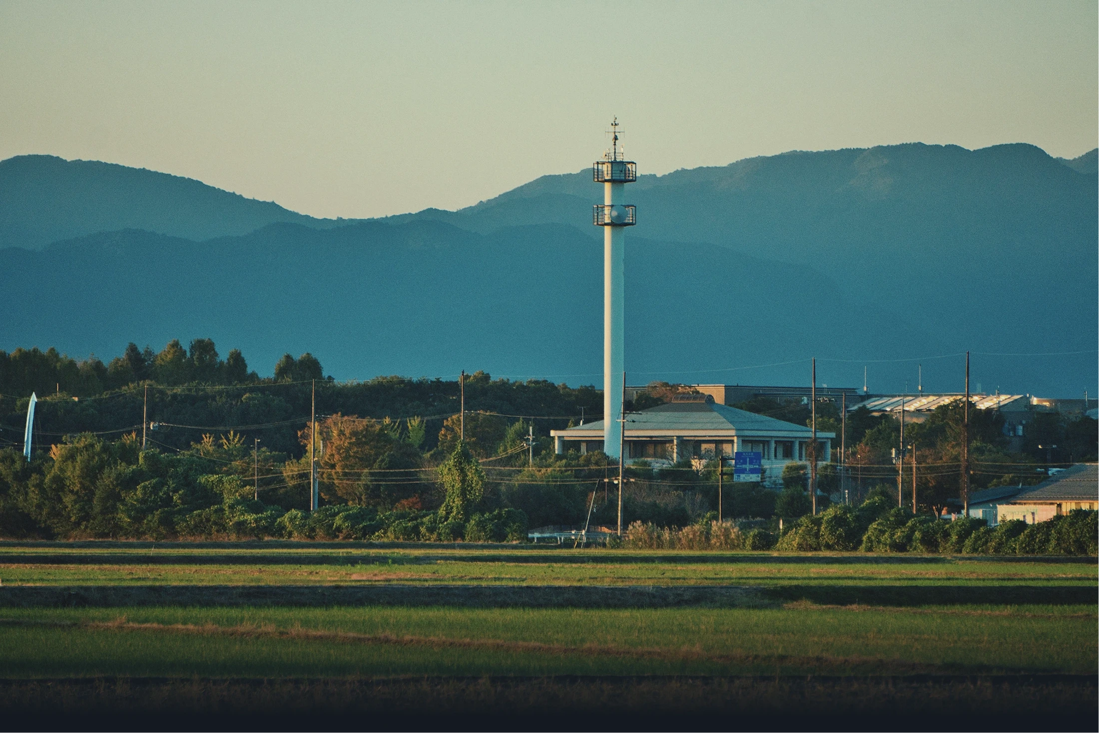
KG Motors is entering into a new market with Mibot, a compact EV designed for elders who require reliable transportation for short-distance travel in rural regions. I’ve designed a landing page that would tell mibot story, highlight its capabilities and features, and drive sales through custom preordering experience. KG Motors is a Japanese EV startup redefining personal mobility with compact, affordable electric vehicles. Their flagship product, Mibot, is a single-seat micro EV designed for short-distance travel, especially in urban and rural Japan. They aimed to position Mibot as a utility-focused yet charming compact EV, while driving sales through a custom-designed preorder experience.
overview
KG Motors is entering into a new market with Mibot, a compact EV designed for elders who require reliable transportation for short-distance travel in rural regions. I’ve designed a landing page that would tell mibot story, highlight its capabilities and features, and drive sales through custom preordering experience. KG Motors is a Japanese EV startup redefining personal mobility with compact, affordable electric vehicles. Their flagship product, Mibot, is a single-seat micro EV designed for short-distance travel, especially in urban and rural Japan. They aimed to position Mibot as a utility-focused yet charming compact EV, while driving sales through a custom-designed preorder experience.
Mibot Landing
Page Walkthru

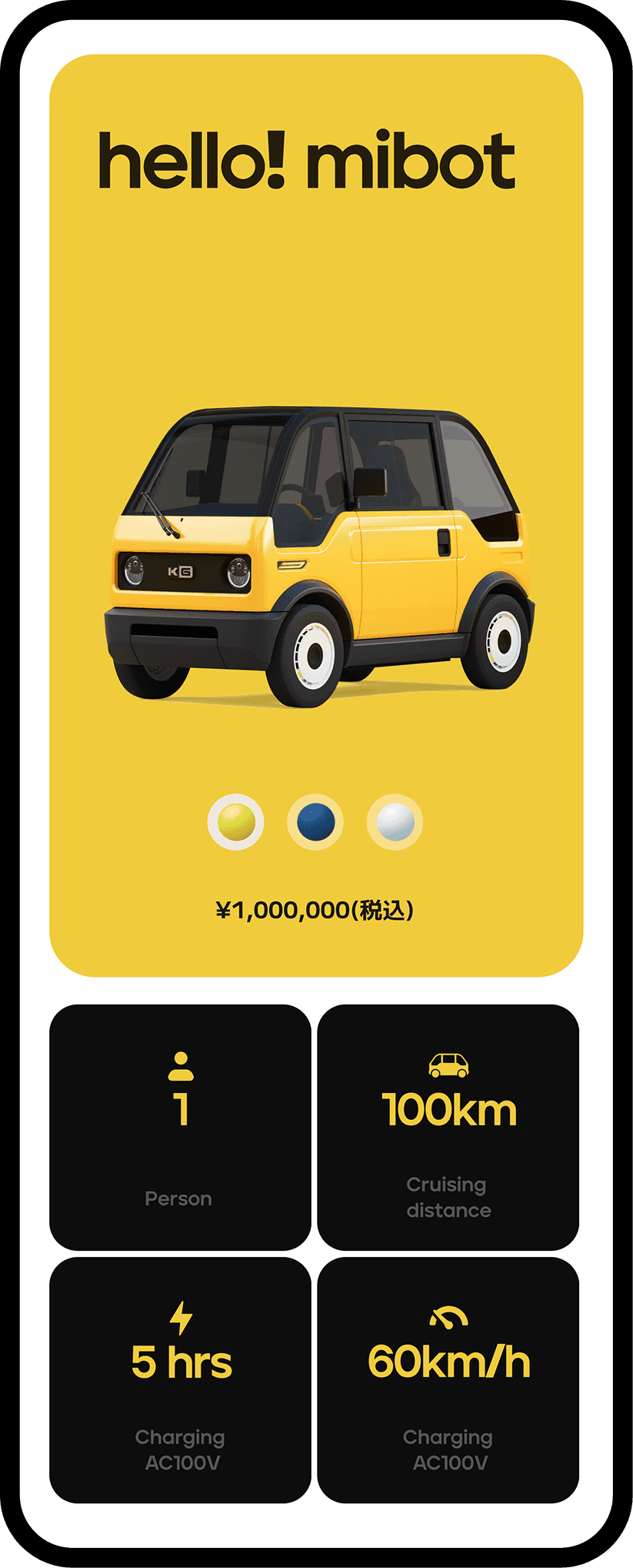

As Mibot is a compact, single-seat EV, a short video showcasing real-world use cases is placed early on the landing page to quickly set expectations and communicate its utility-driven purpose. This is followed by an interactive 3D model that allows users to explore the vehicle from all angles while viewing key specifications, helping create a stronger sense of ownership.
As Mibot is a compact, single-seat EV, a short video showcasing real-world use cases is placed early on the landing page to quickly set expectations and communicate its utility-driven purpose. This is followed by an interactive 3D model that allows users to explore the vehicle from all angles while viewing key specifications, helping create a stronger sense of ownership.


To address questions around Mibot’s capabilities and features, the core features are presented in a full-screen layout designed to capture attention and clearly communicate value. To capture conversions, clear CTAs are placed in the navigation and a final closing CTA at the end of the experience to guide users toward preordering.
To address questions around Mibot’s capabilities and features, the core features are presented in a full-screen layout designed to capture attention and clearly communicate value. To capture conversions, clear CTAs are placed in the navigation and a final closing CTA at the end of the experience to guide users toward preordering.
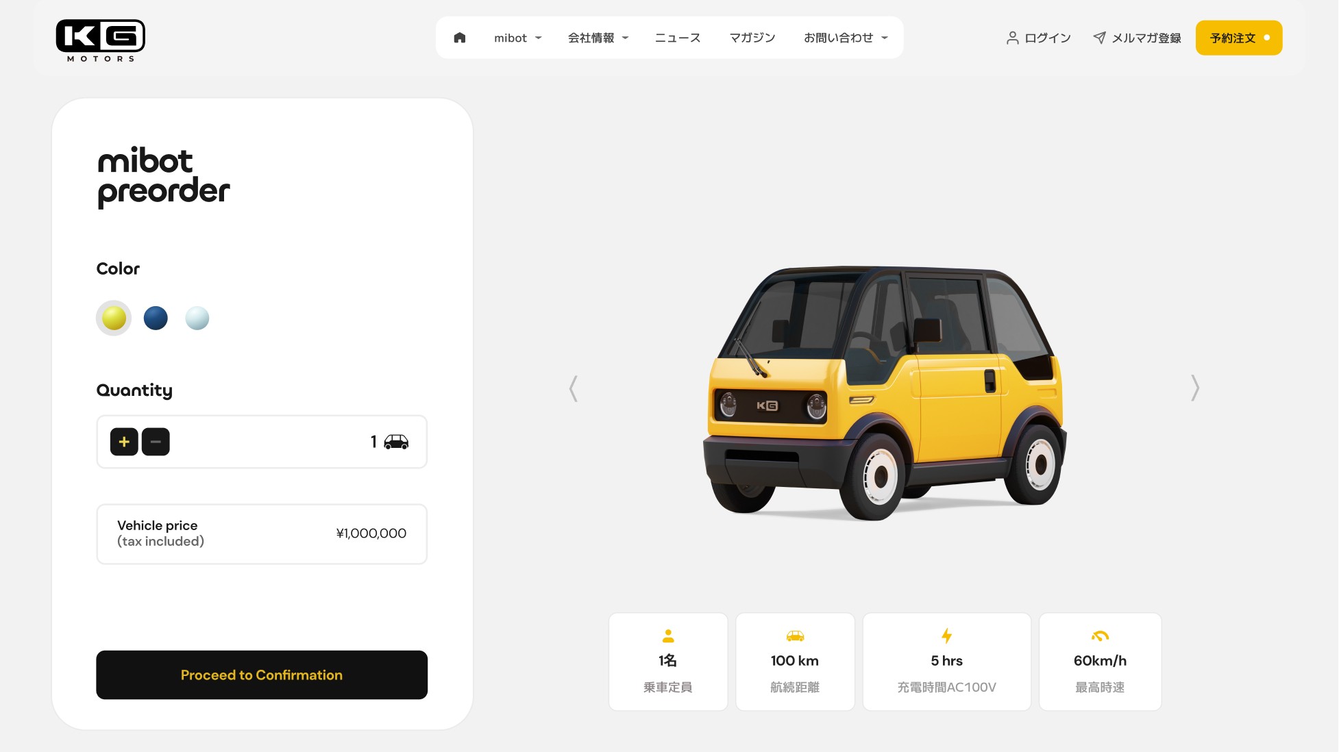
The whole flow for preordering
The whole flow for preordering
The whole flow for preordering

High fidelity of preorder page
High fidelity of preorder page
High fidelity of preorder page
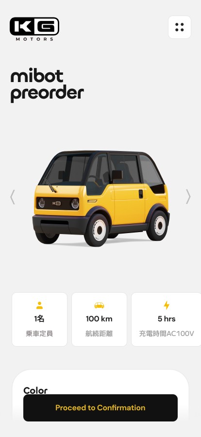
Prototype of the preorder flow
Prototype of the preorder flow
Prototype of the preorder flow
Expand to try out the flow. The expand button is at the top right corner.
This interface is translated. Actual experience is in Japanese.
As a result, after the launch of the website, they opened for reservation and could generate over 3,300 preorders, outpacing major automakers like Toyota in domestic EV sales.
As a result, after the launch of the website, they opened for reservation and could generate over 3,300 preorders, outpacing major automakers like Toyota in domestic EV sales.


Challenges
Design fidelity was impacted by cross-regional development.
You may notice several differences between the mockups and the live website. Although detailed design guidelines and deliverables were shared, the development phase was managed by a separate team in Japan. During implementation, certain adjustments were made to better align with their technical decisions and local considerations.
What I learnt
Working across regions highlighted that design handoff is not a one-time event but an ongoing process. Even with detailed guidelines, differences in technical approach, priorities, and local context can lead to design changes. This project taught me to proactively build alignment through frequent check-ins.

Helping English learners practice speaking through real-life scenarios
Ux / UI / Design Direction / Design system
NOVA is an AI-powered app that gives feedback and targeted suggestions to enhance users’ speaking abilities—making language learning more engaging, practical, and effective.
"/><stop offset="1" stop-color="rgb(42, 147, 126)"/></linearGradient><filter filter-units="objectBoundingBox" height="108.0%" id="g_3KYiu1P-4042401250-shadow-inset" width="105.2%" x="-2.6%" y="-4.0%"><feGaussianBlur in="SourceAlpha" result="g_3KYiu1P-4042401250-shadow-inset-3-blur" stdDeviation="1"/><feOffset dx="1" dy="2" in="g_3KYiu1P-4042401250-shadow-inset-3-blur" result="g_3KYiu1P-4042401250-shadow-inset-3-offset"/><feComposite in="g_3KYiu1P-4042401250-shadow-inset-3-offset" in2="SourceAlpha" k2="-1" k3="1" operator="arithmetic" result="g_3KYiu1P-4042401250-shadow-inset-3-composite"/><feFlood flood-color="rgba(18, 38, 56, 0.25)" result="g_3KYiu1P-4042401250-shadow-inset-3-flood"/><feComposite in="g_3KYiu1P-4042401250-shadow-inset-3-flood" in2="g_3KYiu1P-4042401250-shadow-inset-3-composite" operator="in" result="g_3KYiu1P-4042401250-shadow-inset-3"/><feGaussianBlur in="SourceAlpha" result="g_3KYiu1P-4042401250-shadow-inset-2-blur" stdDeviation="1"/><feOffset dx="1" dy="1" in="g_3KYiu1P-4042401250-shadow-inset-2-blur" result="g_3KYiu1P-4042401250-shadow-inset-2-offset"/><feComposite in="g_3KYiu1P-4042401250-shadow-inset-2-offset" in2="SourceAlpha" k2="-1" k3="1" operator="arithmetic" result="g_3KYiu1P-4042401250-shadow-inset-2-composite"/><feFlood flood-color="rgba(18, 31, 56, 0.45)" result="g_3KYiu1P-4042401250-shadow-inset-2-flood"/><feComposite in="g_3KYiu1P-4042401250-shadow-inset-2-flood" in2="g_3KYiu1P-4042401250-shadow-inset-2-composite" operator="in" result="g_3KYiu1P-4042401250-shadow-inset-2"/><feGaussianBlur in="SourceAlpha" result="g_3KYiu1P-4042401250-shadow-inset-1-blur" stdDeviation="2"/><feOffset dx="-1" dy="-2" in="g_3KYiu1P-4042401250-shadow-inset-1-blur" result="g_3KYiu1P-4042401250-shadow-inset-1-offset"/><feComposite in="g_3KYiu1P-4042401250-shadow-inset-1-offset" in2="SourceAlpha" k2="-1" k3="1" operator="arithmetic" result="g_3KYiu1P-4042401250-shadow-inset-1-composite"/><feFlood flood-color="rgba(175, 227, 205, 0.2)" result="g_3KYiu1P-4042401250-shadow-inset-1-flood"/><feComposite in="g_3KYiu1P-4042401250-shadow-inset-1-flood" in2="g_3KYiu1P-4042401250-shadow-inset-1-composite" operator="in" result="g_3KYiu1P-4042401250-shadow-inset-1"/><feGaussianBlur in="SourceAlpha" result="g_3KYiu1P-4042401250-shadow-inset-0-blur" stdDeviation="1"/><feOffset dx="0" dy="-1" in="g_3KYiu1P-4042401250-shadow-inset-0-blur" result="g_3KYiu1P-4042401250-shadow-inset-0-offset"/><feComposite in="g_3KYiu1P-4042401250-shadow-inset-0-offset" in2="SourceAlpha" k2="-1" k3="1" operator="arithmetic" result="g_3KYiu1P-4042401250-shadow-inset-0-composite"/><feFlood flood-color="rgba(175, 227, 205, 0.35)" result="g_3KYiu1P-4042401250-shadow-inset-0-flood"/><feComposite in="g_3KYiu1P-4042401250-shadow-inset-0-flood" in2="g_3KYiu1P-4042401250-shadow-inset-0-composite" operator="in" result="g_3KYiu1P-4042401250-shadow-inset-0"/><feMerge ><feMergeNode in="g_3KYiu1P-4042401250-shadow-inset-3"/><feMergeNode in="g_3KYiu1P-4042401250-shadow-inset-2"/><feMergeNode in="g_3KYiu1P-4042401250-shadow-inset-1"/><feMergeNode in="g_3KYiu1P-4042401250-shadow-inset-0"/></feMerge></filter><path d="M 125.086 0 C 139.294 0 151.388 2.876 161.368 8.627 C 171.348 14.209 178.96 22.159 184.203 32.477 C 189.616 42.626 192.322 54.551 192.322 68.252 L 192.322 150.458 L 127.877 150.458 L 127.877 77.386 C 127.877 69.267 125.593 63.008 121.026 58.61 C 116.628 54.212 110.369 52.014 102.25 52.014 C 96.499 52.014 91.51 53.197 87.281 55.565 C 83.222 57.764 80.091 61.063 77.893 65.461 C 75.694 69.689 74.595 74.849 74.595 80.938 L 74.595 150.458 L 10.149 150.458 L 10.149 56.834 L 0 4.567 L 64.445 4.567 L 68.957 32.203 C 75.261 22.255 83.455 13.534 93.878 7.865 C 103.519 2.622 113.922 0 125.086 0 Z" id="g_3KYiu1P-4042401250"/></defs><use fill="url(%23g_3KYiu1P-4042401250-linear-gradient)" height="150.458px" href="%23g_3KYiu1P-4042401250" id="g_3KYiu1P" width="192.322px"/><use filter="url(%23g_3KYiu1P-4042401250-shadow-inset)" href="%23g_3KYiu1P-4042401250"/></svg>)
"/><stop offset="1" stop-color="rgb(42, 147, 126)"/></linearGradient><filter filter-units="objectBoundingBox" height="110.4%" id="T1Iaglo5a-1775035763-shadow-inset" width="107.3%" x="-3.6%" y="-5.2%"><feGaussianBlur in="SourceAlpha" result="T1Iaglo5a-1775035763-shadow-inset-3-blur" stdDeviation="3"/><feOffset dx="1" dy="4" in="T1Iaglo5a-1775035763-shadow-inset-3-blur" result="T1Iaglo5a-1775035763-shadow-inset-3-offset"/><feComposite in="T1Iaglo5a-1775035763-shadow-inset-3-offset" in2="SourceAlpha" k2="-1" k3="1" operator="arithmetic" result="T1Iaglo5a-1775035763-shadow-inset-3-composite"/><feFlood flood-color="rgba(11, 15, 43, 0.2)" result="T1Iaglo5a-1775035763-shadow-inset-3-flood"/><feComposite in="T1Iaglo5a-1775035763-shadow-inset-3-flood" in2="T1Iaglo5a-1775035763-shadow-inset-3-composite" operator="in" result="T1Iaglo5a-1775035763-shadow-inset-3"/><feGaussianBlur in="SourceAlpha" result="T1Iaglo5a-1775035763-shadow-inset-2-blur" stdDeviation="1.5"/><feOffset dx="0" dy="1" in="T1Iaglo5a-1775035763-shadow-inset-2-blur" result="T1Iaglo5a-1775035763-shadow-inset-2-offset"/><feComposite in="T1Iaglo5a-1775035763-shadow-inset-2-offset" in2="SourceAlpha" k2="-1" k3="1" operator="arithmetic" result="T1Iaglo5a-1775035763-shadow-inset-2-composite"/><feFlood flood-color="rgba(11, 15, 43, 0.35)" result="T1Iaglo5a-1775035763-shadow-inset-2-flood"/><feComposite in="T1Iaglo5a-1775035763-shadow-inset-2-flood" in2="T1Iaglo5a-1775035763-shadow-inset-2-composite" operator="in" result="T1Iaglo5a-1775035763-shadow-inset-2"/><feGaussianBlur in="SourceAlpha" result="T1Iaglo5a-1775035763-shadow-inset-1-blur" stdDeviation="2"/><feOffset dx="-1" dy="-2" in="T1Iaglo5a-1775035763-shadow-inset-1-blur" result="T1Iaglo5a-1775035763-shadow-inset-1-offset"/><feComposite in="T1Iaglo5a-1775035763-shadow-inset-1-offset" in2="SourceAlpha" k2="-1" k3="1" operator="arithmetic" result="T1Iaglo5a-1775035763-shadow-inset-1-composite"/><feFlood flood-color="rgba(139, 224, 178, 0.2)" result="T1Iaglo5a-1775035763-shadow-inset-1-flood"/><feComposite in="T1Iaglo5a-1775035763-shadow-inset-1-flood" in2="T1Iaglo5a-1775035763-shadow-inset-1-composite" operator="in" result="T1Iaglo5a-1775035763-shadow-inset-1"/><feGaussianBlur in="SourceAlpha" result="T1Iaglo5a-1775035763-shadow-inset-0-blur" stdDeviation="1"/><feOffset dx="0" dy="-1" in="T1Iaglo5a-1775035763-shadow-inset-0-blur" result="T1Iaglo5a-1775035763-shadow-inset-0-offset"/><feComposite in="T1Iaglo5a-1775035763-shadow-inset-0-offset" in2="SourceAlpha" k2="-1" k3="1" operator="arithmetic" result="T1Iaglo5a-1775035763-shadow-inset-0-composite"/><feFlood flood-color="rgba(139, 224, 178, 0.35)" result="T1Iaglo5a-1775035763-shadow-inset-0-flood"/><feComposite in="T1Iaglo5a-1775035763-shadow-inset-0-flood" in2="T1Iaglo5a-1775035763-shadow-inset-0-composite" operator="in" result="T1Iaglo5a-1775035763-shadow-inset-0"/><feMerge ><feMergeNode in="T1Iaglo5a-1775035763-shadow-inset-3"/><feMergeNode in="T1Iaglo5a-1775035763-shadow-inset-2"/><feMergeNode in="T1Iaglo5a-1775035763-shadow-inset-1"/><feMergeNode in="T1Iaglo5a-1775035763-shadow-inset-0"/></feMerge></filter><path d="M 121.026 0 C 135.404 0 147.921 3.214 158.577 9.642 C 169.233 16.069 177.522 25.119 183.442 36.79 C 189.532 48.461 192.576 62.078 192.576 77.64 C 192.576 93.032 189.532 106.564 183.442 118.235 C 177.522 129.907 169.234 138.956 158.577 145.384 C 147.921 151.811 135.404 155.025 121.026 155.025 C 107.156 155.025 94.808 151.811 83.982 145.384 C 76.457 140.845 69.946 135.038 64.445 127.969 L 64.445 192.322 L 0 192.322 L 0 4.567 L 64.445 4.567 L 64.445 26.818 C 70.043 19.76 76.639 14.034 84.236 9.642 C 95.062 3.214 107.325 0 121.026 0 Z M 100.221 48.461 C 94.639 48.461 89.226 49.729 83.982 52.267 C 78.739 54.804 74.172 58.272 70.281 62.67 C 66.391 67.068 63.6 72.058 61.908 77.64 C 63.6 83.221 66.391 88.212 70.281 92.609 C 74.172 96.838 78.739 100.221 83.982 102.758 C 89.226 105.295 94.639 106.563 100.221 106.563 C 105.633 106.563 110.369 105.295 114.429 102.758 C 118.657 100.221 121.871 96.838 124.07 92.609 C 126.438 88.212 127.623 83.221 127.623 77.64 C 127.623 72.058 126.438 67.068 124.07 62.67 C 121.871 58.272 118.657 54.804 114.429 52.267 C 110.369 49.73 105.633 48.461 100.221 48.461 Z" id="T1Iaglo5a-1775035763"/></defs><use fill="url(%23T1Iaglo5a-1775035763-linear-gradient)" height="192.322px" href="%23T1Iaglo5a-1775035763" id="T1Iaglo5a" width="192.576px"/><use filter="url(%23T1Iaglo5a-1775035763-shadow-inset)" href="%23T1Iaglo5a-1775035763"/></svg>)
"/><stop offset="1" stop-color="rgb(42, 147, 126)"/></linearGradient><filter filter-units="objectBoundingBox" height="109.0%" id="erQrIfrFl-4067519641-shadow-inset" width="105.1%" x="-2.6%" y="-4.5%"><feGaussianBlur in="SourceAlpha" result="erQrIfrFl-4067519641-shadow-inset-3-blur" stdDeviation="1.975"/><feOffset dx="0.99" dy="2.96" in="erQrIfrFl-4067519641-shadow-inset-3-blur" result="erQrIfrFl-4067519641-shadow-inset-3-offset"/><feComposite in="erQrIfrFl-4067519641-shadow-inset-3-offset" in2="SourceAlpha" k2="-1" k3="1" operator="arithmetic" result="erQrIfrFl-4067519641-shadow-inset-3-composite"/><feFlood flood-color="rgba(18, 31, 56, 0.2)" result="erQrIfrFl-4067519641-shadow-inset-3-flood"/><feComposite in="erQrIfrFl-4067519641-shadow-inset-3-flood" in2="erQrIfrFl-4067519641-shadow-inset-3-composite" operator="in" result="erQrIfrFl-4067519641-shadow-inset-3"/><feGaussianBlur in="SourceAlpha" result="erQrIfrFl-4067519641-shadow-inset-2-blur" stdDeviation="1.48"/><feOffset dx="0" dy="0.99" in="erQrIfrFl-4067519641-shadow-inset-2-blur" result="erQrIfrFl-4067519641-shadow-inset-2-offset"/><feComposite in="erQrIfrFl-4067519641-shadow-inset-2-offset" in2="SourceAlpha" k2="-1" k3="1" operator="arithmetic" result="erQrIfrFl-4067519641-shadow-inset-2-composite"/><feFlood flood-color="rgba(18, 31, 56, 0.35)" result="erQrIfrFl-4067519641-shadow-inset-2-flood"/><feComposite in="erQrIfrFl-4067519641-shadow-inset-2-flood" in2="erQrIfrFl-4067519641-shadow-inset-2-composite" operator="in" result="erQrIfrFl-4067519641-shadow-inset-2"/><feGaussianBlur in="SourceAlpha" result="erQrIfrFl-4067519641-shadow-inset-1-blur" stdDeviation="1.975"/><feOffset dx="-0.99" dy="-1.98" in="erQrIfrFl-4067519641-shadow-inset-1-blur" result="erQrIfrFl-4067519641-shadow-inset-1-offset"/><feComposite in="erQrIfrFl-4067519641-shadow-inset-1-offset" in2="SourceAlpha" k2="-1" k3="1" operator="arithmetic" result="erQrIfrFl-4067519641-shadow-inset-1-composite"/><feFlood flood-color="rgba(156, 230, 192, 0.2)" result="erQrIfrFl-4067519641-shadow-inset-1-flood"/><feComposite in="erQrIfrFl-4067519641-shadow-inset-1-flood" in2="erQrIfrFl-4067519641-shadow-inset-1-composite" operator="in" result="erQrIfrFl-4067519641-shadow-inset-1"/><feGaussianBlur in="SourceAlpha" result="erQrIfrFl-4067519641-shadow-inset-0-blur" stdDeviation="0.99"/><feOffset dx="0" dy="-0.99" in="erQrIfrFl-4067519641-shadow-inset-0-blur" result="erQrIfrFl-4067519641-shadow-inset-0-offset"/><feComposite in="erQrIfrFl-4067519641-shadow-inset-0-offset" in2="SourceAlpha" k2="-1" k3="1" operator="arithmetic" result="erQrIfrFl-4067519641-shadow-inset-0-composite"/><feFlood flood-color="rgba(156, 230, 192, 0.35)" result="erQrIfrFl-4067519641-shadow-inset-0-flood"/><feComposite in="erQrIfrFl-4067519641-shadow-inset-0-flood" in2="erQrIfrFl-4067519641-shadow-inset-0-composite" operator="in" result="erQrIfrFl-4067519641-shadow-inset-0"/><feMerge ><feMergeNode in="erQrIfrFl-4067519641-shadow-inset-3"/><feMergeNode in="erQrIfrFl-4067519641-shadow-inset-2"/><feMergeNode in="erQrIfrFl-4067519641-shadow-inset-1"/><feMergeNode in="erQrIfrFl-4067519641-shadow-inset-0"/></feMerge></filter><path d="M 96.622 0 C 96.787 0 97.357 0 97.724 0 C 116.78 0 133.411 3.176 147.619 9.528 C 161.993 15.879 173.109 24.822 180.965 36.355 C 188.988 47.888 193 61.343 193 76.721 C 193 91.931 188.988 105.303 180.965 116.836 C 173.109 128.369 161.993 137.312 147.619 143.664 C 133.411 150.015 116.78 153.191 97.724 153.191 C 78.669 153.191 61.954 150.015 47.579 143.664 C 33.372 137.312 22.256 128.369 14.233 116.836 C 6.377 105.303 2.449 91.931 2.449 76.721 C 2.449 61.343 6.377 47.888 14.233 36.355 C 15.375 34.714 16.582 33.126 17.849 31.59 L 0 31.59 C 24.077 12.692 56.752 0 96.622 0 Z M 97.724 46.384 C 91.206 46.384 85.606 47.553 80.926 49.893 C 76.246 52.233 72.652 55.661 70.145 60.174 C 67.805 64.687 66.634 70.119 66.634 76.471 C 66.635 82.99 67.805 88.505 70.145 93.018 C 72.652 97.531 76.246 100.957 80.926 103.297 C 85.607 105.637 91.206 106.808 97.724 106.808 C 104.41 106.808 110.01 105.637 114.523 103.297 C 119.203 100.957 122.714 97.531 125.054 93.018 C 127.561 88.505 128.814 83.072 128.814 76.721 C 128.814 70.202 127.561 64.687 125.054 60.174 C 122.714 55.661 119.203 52.233 114.523 49.893 C 110.01 47.553 104.41 46.384 97.724 46.384 Z" id="erQrIfrFl-4067519641"/></defs><use fill="url(%23erQrIfrFl-4067519641-linear-gradient)" height="153.19135391610217px" href="%23erQrIfrFl-4067519641" id="erQrIfrFl" width="193px"/><use filter="url(%23erQrIfrFl-4067519641-shadow-inset)" href="%23erQrIfrFl-4067519641"/></svg>)